

Village Baking Co. Website Redesign
We have observed that their website isn’t meeting the goals of positive impact, brand and product awareness, which is causing negative user experience and feedback potentially impacting the potential outreach of their business. Our goal is to redesign the Village Baking Co. website to improve navigation and usability.
My Role
01.
I participated as a UX/UI designer with my design team of 6.
02.
I was directly involved in:
-
User Research/Interview
-
User Journey Map
-
Heuristic Evaluation
-
Color Accessibility Test
-
User flow
-
Wireframing
-
Prototyping
-
User Testing
-
A/B Testing
03.
Problem:
Their current website lacks responsive web design, there are some unreliable buttons, outdated information, and design that is not accessible. There are opportunities to improve the design of the website to improve the experience of the users and improve business outcomes.
04.
Target Audience:
Young people and families who are looking for high quality products.
05.
Tools:
-
Trello
-
Figma
-
FigJam
-
Miro
-
Google Slides
Overview
As a UX/UI designer, I want to understand the pain points of users when navigating the Village Bakery Co. website.
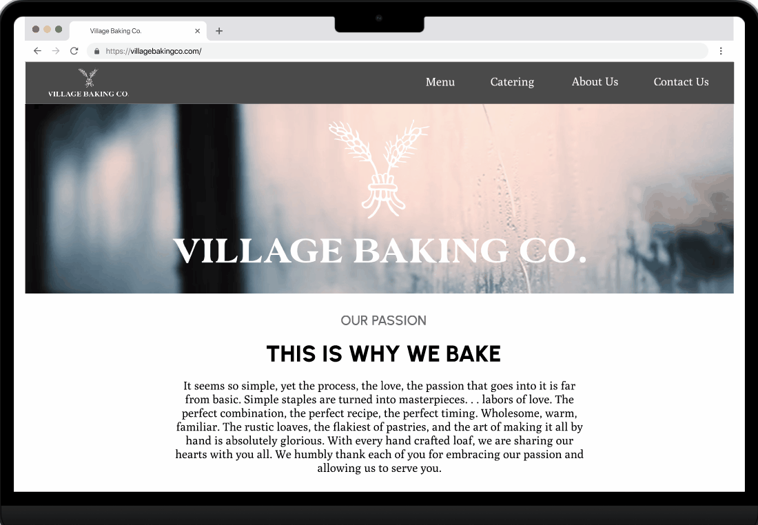
Village Baking Co. website was designed to improve awareness on brand and product offering . My team and I have observed that our website isn’t meeting these goals, which is causing negative user experience and feedback potentially impacting the potential outreach of their business. How might we improve the website so that their customers are successfully able to view relevant information, navigate efficiently and recognize the culture and quality of the bakery.

UX Research
Highlights of our research
During our interviews with bakery enthusiasts regarding the overall user interface design of Village Baking Co. 's website, we discovered that the website was not very accessible for their users and the information is outdated.
Therefore, we believe that there is an opportunity to improve the accessibility and user interface design by redesigning the website to ensure that it is more user friendly and also provide more elements that could benefit the business.
In our annotations, we agreed that the visuals were appealing for the users but the functionality was below par. There are issues with the fonts, in both readability and accessibility in contrast to the colors used.
From the website currently, there is not much that the user can do. Users are able to get to online catering and try to get to online ordering. Once, users are able to find the menu, many of the items are not sold in stores.
I broke down the data into pain points that all of our users had and created our user, Sweet Tooth Sally. Sweet Tooth Sally wants to find the perfect bakery to get a pastry. She is looking for a sweet pastry in the Dallas area and finds Village Baking Co near her. She visits the website but has trouble finding the menu. She eventually finds the menu and when she goes to the bakery, she finds out that the menu does not carry the pastry anymore. She quickly picks a different item but is still satisfied with the pastry.
I compared 2 direct competitors in the Dallas area and 2 indirect competitors. To highlight one of the direct competitors, Bisous Bisous Pâtisserie, is also a French bakery that has an interactive online menu, online ordering, and mentions fresh ingredients. The down sides of BBP when compared to Village Baking Co. are that they have poor customer service and no catering. Village Baking Co. also has more locations than BBP to increase business in the Dallas area.


UI Style Guide & Mood board
From the heuristic analysis of the Village Banking Company’s website, we created a UI Style Guide and a Mood board that will make the overall look more cohesive. The website's current style and font they used did not pass the accessibility test. We made changes to the font and size but decided to maintain their initial color palette ( black, beige, blue, and white). Our mood board represents a French style cafe with a focus on the products and what users post on their social media to promote the business.
Lo-Fi/Mid-Fi Wireframes
My first goal was to address the home page. It was too lengthy and could allocate certain details to new pages. With my team, we drafted some sketches to simplify the home page and to redesign the menu.
From our sketches, we got to work on the mid-fi wireframes. We agreed to keep a large portion of the visuals since the users enjoyed the look of the images. Our goals were to fix the home page, the menu, and to have an interactive map for locations of the businesses.
After testing the Mid-Fi prototype, the feed back we received was to address the multiple screens for locations into one responsive design that includes all elements. Change the Footer content that should be distributed in the space. And include links to social media as icons.


Hi-Fi Wireframes
My team divided pages to each member and worked on those certain pages to maximize our time for the project. I worked on the home page for both mobile and desktop. A goal for the home page, I wanted to have a carousel of photos gathered from their Instagram page to showcase their product and brand. Then I addressed the issue with a map location for each branch's locations. Using an interactive map that when you select a start or the name of the location, it will bring up the address of the business, with it being highlighted on the map. As our team were close to completing the redesign, we went to user testing to analyze the feedback and make adjustments.
After Hi-Fi testing and analyzing the results we came to the result of needing iterations to the Career Page.
We first started the change with the Location position, dividing the jobs based on location.
Then, we cleaned up the look by removing components that did not serve the user.
A/B Testing
For our A/B testing, my team and I focused on 2 different menu types. In the current website, the menu is outdated, lacking prices, and presenting products that are not sold anymore. The 2 menu types we tested are: Menu A with images for each product so that users/customers know what they are getting and Menu B with a more descriptive menu of each product and more representative of a classic physical menu.
During our usability testings, we had users say it looks like online ordering. To the owner's request, he doesn’t want online ordering because they do not have the capability. As a result of the testing, users did overall like Menu B over Menu A.

Menu A
Menu B

Impact
Statement &
Final Thoughts
As a result, we were able to improve customer experience by increasing accessibility, updating the information, and making it easier to navigate. And in conclusion, the business will be able to thrive because the users will want to visit Village Baking Co. after seeing our webpage.
All in all, despite our short time frame for this project, my team and I made the best use of our time and was able to accomplish so much. With the help of our many user testings, we were able to improve the web design and create something that we are proud of. If granted, the next steps we are considering are to add a FAQ page that includes dietary needs, adding more to the about us page, and possibly updating the menu to allow users to hover over the menu items to view the images.